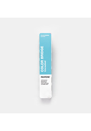
PANTONE Formula Guide Set Coated & Uncoated | 2,614 PMS Spot Colours
Two portable Pantone fan guides with 2,614 PMS spot colours, ink formulations and coated and uncoated references for professional print workflows.
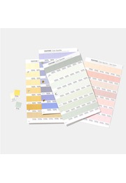
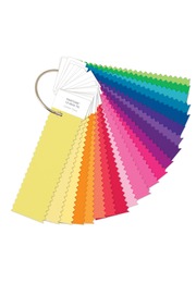
The PANTONE Formula Guide Set Coated & Uncoated is the essential professional colour communication tool for selecting, specifying, matching and approving Pantone spot colours. This latest edition brings together all 2,614 market-driven colours in the Pantone Graphics System, presented as two portable fan decks on coated and uncoated paper. It is designed for graphic designers, brand teams, packaging specialists, printers, prepress professionals, creative agencies and production partners who need to communicate colour with confidence from initial inspiration to the final press check.
At the heart of the set is the Pantone Matching System, the internationally recognised colour language used to define and reproduce spot colours. Unlike colours viewed only on a monitor, each shade in the Formula Guide is printed as a physical ink reference. This gives creative and production teams a more dependable basis for decisions involving logos, corporate identities, packaging, labels, marketing materials, editorial design, signage and other colour-critical graphic applications.
The expanded collection contains 224 brand-new Pantone Matching System colours. Developed in response to contemporary market and design needs, these additions introduce fresh creative possibilities shaped by nostalgia, optimism and joyful expression. The new shades are displayed at the front of each guide, making them easy to discover when building palettes, refreshing a visual identity or establishing a new colour direction. Together, all 2,614 shades create the largest gamut within the Pantone Graphics System.
Both coated and uncoated references are included because paper surface has a substantial effect on colour appearance. Coated stock generally holds ink closer to the surface, creating a cleaner, sharper and often more saturated result. Uncoated stock absorbs more ink and can make the same colour appear softer, more matte or less intense. Comparing the C and U references helps teams select the correct Pantone designation for the intended material before artwork, proofing and production begin.
The coated guide is printed on widely used 100 lb coated stock, equivalent to 168 g/m², while the uncoated guide uses 80 lb uncoated stock at 118 g/m². These practical paper weights provide relevant physical references for commercial print and packaging workflows. They help users evaluate the likely visual character of a spot colour on common substrates instead of relying on digital simulations that can vary between screens, software settings and viewing conditions.
Every colour is identified by its Pantone number and accompanied by its ink formulation. This technical information turns the Formula Guide from an inspirational colour library into an end-to-end production tool. Designers can define a precise colour intention, clients can approve the same reference and printers can use the formulation as a basis for mixing the required Pantone spot ink. The result is clearer communication and fewer avoidable interpretation errors between concept development, prepress, proofing and printing.
Spot colours are particularly valuable where recognition and repeatability matter. A specifically mixed Pantone ink can deliver defined brand colours and saturated shades that may be difficult to reproduce consistently through CMYK process printing alone. For corporate design systems, logos, packaging families and international campaigns, the Formula Guide supports a shared colour standard that remains understandable across departments, suppliers, printing locations and production markets.
The enhanced printing process used for this edition improves the accuracy of the physical colour presentation. A numeric index at the back of each guide helps users locate any Pantone reference quickly, while the chromatic organisation supports intuitive browsing through related colour families. This dual structure makes the set equally effective when a specific number is already known and when the objective is open-ended colour exploration.
A Lighting Indicator page demonstrates whether ambient lighting conditions are suitable for visual colour evaluation. This is important because an approved colour may appear warmer, cooler, lighter or darker under unsuitable illumination. By checking the viewing environment before comparing samples, teams can make more reliable decisions during studio reviews, client presentations, supplier meetings, proof approvals and press checks.
The compact handheld format fits naturally into fast-moving professional workflows. Both fan decks travel easily between design studio, client meeting, print supplier and production site. They support creative inspiration, palette development, brand and packaging specification, supplier communication, proof review and final production control. Although the Pantone Graphics System is developed primarily for print, it can also establish an initial colour target for branded components, displays, coatings and related product applications. Final approval should always take place on the intended production material.
Pantone Connect complements the physical Formula Guides with a digital environment for accessing more than 20,000 current Pantone colours, creating palettes and colour stories, converting colour data into RGB, CMYK and Hex formats, collaborating with team members and connecting Pantone colour workflows with Adobe applications. Access to Pantone Connect is separate from the physical guide set and may require a trial or subscription, but it provides a useful bridge between tangible colour evaluation and digital design execution.
Physical guides remain indispensable even in digitally led workflows. Monitors, calibration, ambient light and output profiles can all change how a colour appears on screen. The PANTONE Formula Guide Set provides the shared printed reference needed to align creative intent with real-world output. Used under suitable lighting and checked against the intended substrate, it helps professionals reduce ambiguity, accelerate approvals and protect colour consistency from design through production.
For teams working in branding, packaging, marketing and print, the PANTONE Formula Guide Set Coated & Uncoated is a fundamental colour specification resource. With 2,614 spot colours, 224 new market-relevant additions, coated and uncoated references, ink formulations and portable fan decks, it brings creative range and technical precision together in one globally understood professional tool.
Key Benefits
- Two portable Pantone fan guides: Coated and Uncoated
- 2,614 Pantone spot colours in the Graphics System
- 224 brand-new, market-relevant PMS colours
- Largest gamut in the Pantone Graphics System
- New colours positioned at the front for easy discovery
- Pantone number and ink formulation shown for every colour
- Enhanced printing process for improved colour accuracy
- Printed on 100 lb / 168 g/m² coated paper
- Printed on 80 lb / 118 g/m² uncoated paper
- Numeric index for fast colour location
- Chromatic organisation for intuitive palette development
- Lighting Indicator page for more reliable visual evaluation
- Supports colour selection, specification, approval and press checks
- Ideal for branding, packaging, marketing and graphic design
- Shared colour language for international teams and supply chains