PANTONE® Color Bridge Guide Set | Coated & Uncoated
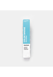
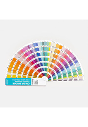
The PANTONE Color Bridge Guide Set Coated & Uncoated is a professional colour conversion system for understanding how Pantone Spot Colours translate into standard CMYK process printing. The two portable fan decks present side-by-side comparisons of all 2,587 Pantone Spot Colours with their closest industry-standard CMYK matches on coated and uncoated paper. CMYK, RGB and HTML values also connect the physical references with digital design workflows.
Designed for graphic designers, brand teams, packaging specialists, printers, prepress professionals, marketing departments and digital creatives, the set supports colour decisions throughout the complete design and production process. It helps users explore colour, evaluate conversion differences, specify output values, communicate realistic expectations and check printed results against a recognised physical reference.
A Pantone Spot Colour and its CMYK process simulation are not technically identical. Spot colours are produced using specifically mixed inks, while CMYK builds colour through combinations of cyan, magenta, yellow and black. The two systems have different colour gamuts, meaning that some Pantone colours can be simulated closely while others become less saturated, lighter, darker or visibly different in hue.
The Color Bridge guides make these differences immediately visible. Every original Pantone Spot Colour appears beside its nearest CMYK equivalent. Instead of depending entirely on a monitor or automated software conversion, designers, clients and production partners can examine a physical printed comparison before deciding how a colour should be reproduced.
This clarity supports both creative quality and production efficiency. If the CMYK result is sufficiently close, a project may be printed without an additional spot ink. If the conversion compromises brand recognition, visual impact or product differentiation, teams can retain the Pantone Spot Colour, select a more reproducible alternative or establish a deliberately adjusted process-colour standard.
The updated set features 2,587 Pantone Spot Colours, including 224 vibrant new PMS colours. These trend-driven additions expand the creative range for contemporary branding, packaging, editorial design and visual communication. The new colours are positioned at the beginning of each guide for immediate discovery, while the complete collections are organised chromatically to support intuitive exploration of related colour families.
Including both coated and uncoated references is a major workflow advantage. Paper surface, absorbency and finish can substantially alter the appearance of printed colour. Coated stock keeps more ink near the surface and generally produces cleaner, sharper and more saturated results. Uncoated paper absorbs more ink, often creating a softer, more matte and less concentrated colour impression.
A CMYK conversion that appears convincing on coated paper may look noticeably different on an uncoated substrate. By placing both guide types in one set, Color Bridge allows professionals to evaluate these differences before artwork, proofing and production begin. This is especially useful when one brand system must work across coated packaging, magazines and labels as well as stationery, booklets, inserts and natural-finish papers.
The Coated guide is printed on commonly used 100 lb coated paper with a weight of 148 g/m². The Uncoated guide uses 80 lb uncoated paper at 118 g/m². These practical paper weights provide relevant physical references for commercial printing rather than abstract digital simulations.
The CMYK values have been updated using G7 methodology to better represent contemporary colour management and standard printing conditions. Pantone states that the guides are aligned with CRPC6 and CRPC3 press references for coated and uncoated paper. This alignment gives designers, print buyers and production teams a more realistic basis for evaluating process-colour conversion and discussing expected output.
Each Pantone Spot Colour is accompanied by its corresponding CMYK percentages, RGB values and HTML/Hex information. Color Bridge is the only physical Pantone guide that combines all three conversion formats with Pantone Spot Colours. This makes the set particularly valuable for integrated identities and campaigns that must coordinate colour across packaging, printed graphics, websites, interfaces, digital advertising, animation and video.
The CMYK percentages give artwork and prepress teams a defined starting point for four-colour production. RGB and HTML values support screen-based applications and help digital teams connect their work to the same Pantone colour intention. These references improve cross-media consistency while recognising that ink on paper and colour produced by illuminated displays cannot appear completely identical.
For brand management, the set helps establish related spot, process and digital colour standards in identity guidelines. Packaging designers can evaluate conversions on coated and uncoated materials before committing to a print specification. Graphic designers gain realistic references for publications, corporate stationery and marketing collateral, while digital specialists receive coordinated RGB and HTML values for web, motion and screen applications.
The chromatic arrangement allows users to browse colour families, compare neighbouring shades and develop palettes intuitively. A numeric index at the back of each guide provides the location of every colour when a particular Pantone reference is already known. This dual navigation supports both open creative exploration and fast technical specification.
Integrated Lighting Indicator pages show whether the surrounding illumination is suitable for proper colour evaluation. Unsuitable lighting can make a printed colour appear warmer, cooler, lighter or darker and distort the perceived difference between a spot colour and its CMYK equivalent. Checking the viewing environment supports more dependable decisions during presentations, proof reviews and press checks.
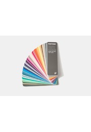
The handheld fan-deck format allows both guides to travel easily between design studio, client meeting, brand department, print supplier and production site. All participants can work with the same physical references, making colour differences easier to explain, compare and approve throughout international workflows.
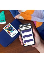
Pantone Connect can complement the physical guides with access to more than 20,000 current Pantone colours, Adobe application integration, digital colour conversion, palette development and collaborative functionality. Pantone Connect is separate from the printed set and may require a trial or paid subscription.
Color Bridge provides professional conversion references rather than guaranteed production results. Actual output is influenced by paper, ink, press calibration, screening, colour profiles, printing tolerances and finishing. Final approval should therefore be based on a production proof or press sheet using the intended substrate under controlled lighting.
For projects that combine Pantone Spot Colours, CMYK printing and digital media, the PANTONE Color Bridge Guide Set Coated & Uncoated provides essential colour intelligence. It makes conversion and substrate differences visible, supports commercially informed production decisions and creates a shared colour language throughout the complete creative workflow.
Key Benefits
- Two portable Pantone Color Bridge fan guides
- Coated and uncoated references in one set
- 2,587 Pantone Spot Colours with CMYK matches
- Includes 224 new, trend-driven PMS colours
- Spot and process colours displayed side by side
- CMYK percentages supplied for every colour
- RGB values for screen-based applications
- HTML/Hex values for web and digital design
- Printed on 100 lb / 148 g/m² coated paper
- Printed on 80 lb / 118 g/m² uncoated paper
- Updated CMYK values produced using G7 methodology
- Aligned with CRPC6 and CRPC3 press references
- Chromatic arrangement and numerical indexes
- Lighting Indicator pages for viewing-condition checks
- Supports workflows from colour inspiration to press check