PANTONE Reference Library | Complete Graphics Colour System with 8,706 Colours
Complete Pantone Graphics library with 8,706 colour options, eight fan guides, four removable-chip books and a desktop stand.
The PANTONE Reference Library is Pantone’s most comprehensive professional desktop colour system for graphics, print and cross-media design. It combines eight portable fan guides and four ring-bound chip books in a sturdy display stand, giving design studios, brand departments, packaging teams, printers, educational institutions and production specialists centralized access to 8,706 spot, spot-to-process, process and specialty spot-colour options.
Designed as a shared workplace resource, the library supports the complete colour workflow: creative exploration, palette development, colour comparison, technical specification, client presentation, production communication, quality control and final approval. Instead of storing individual Pantone products in different locations, teams can keep the principal Pantone Graphics guides and removable-chip collections together, protected and immediately accessible.
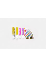
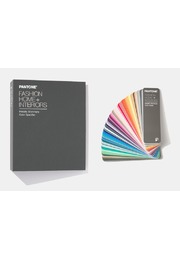
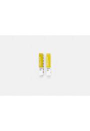
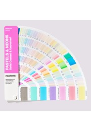
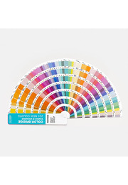
The library includes the PANTONE Formula Guide Coated & Uncoated, Color Bridge Guide Set Coated & Uncoated, CMYK Guide Set Coated & Uncoated, Metallics Guide and Pastels & Neons Guide. Its four ring-bound books comprise Solid Chips Coated and Uncoated, the Pastels & Neons Chips Book and the Metallic Chips Book.
The updated edition incorporates 224 new trend-driven Pantone Matching System colours into the Formula Guides, Color Bridge Guides and Solid Chips Books. These additions extend the available palette with fresh, market-relevant colour directions and fill important gaps in the existing system. New pages are marked at the top corners and integrated within the chromatically organized collections, making the latest colours easy to identify without disrupting intuitive colour-family browsing.
Within its coordinated colour systems, the Reference Library provides access to 2,614 traditional Pantone Spot Colours, 2,587 spot-to-process references, 2,868 four-colour CMYK process colours and 865 metallic, pastel and neon specialty spot colours. Every colour appears with its corresponding Pantone number and the relevant ink formulation, CMYK build or digital colour values.
The Formula Guides provide the core Pantone spot-colour references for coated and uncoated paper. Ink formulations give printers a technical starting point for mixing Pantone Spot Colours, while designers and clients can use the same globally recognized colour designation. This shared language reduces ambiguity when branding, packaging and printed materials are developed with multiple suppliers or produced in different markets.
The Color Bridge Guides place Pantone Spot Colours beside their closest process-colour simulations. Pantone CMYK, HTML and RGB values help teams visualize how a selected spot colour may translate into four-colour printing and digital applications. This is valuable when a corporate or packaging colour must remain visually coherent across spot-colour print, CMYK materials, websites, digital graphics, animation and video.
The CMYK Guides expand process-colour exploration with 2,868 four-colour combinations. They are useful when a project will be produced exclusively through standard CMYK printing and a dedicated Pantone spot ink is not required. Metallics and Pastels & Neons add 865 specialty spot colours for premium finishes, subtle tonal concepts and vivid high-impact applications.
The fan guides provide fast, portable references for browsing, comparison, meetings and press checks. Their compact format makes it easy to move colour decisions between creative studio, customer presentation, prepress department and production site. Numerical indexes at the back help users locate known Pantone references quickly, while the chromatic arrangement encourages open-ended palette development.
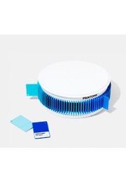
The chip books turn selected colours into removable working samples. Each page displays up to seven Pantone colours with six individual chips per colour, each approximately 1.2 × 0.8 inches. Perforated chips can be used in mood boards, presentation materials, packaging mock-ups, specifications and supplier documentation. Their three-sided colour bleed minimizes interference from surrounding white paper and supports more effective side-by-side evaluation.
Built-in paper chip savers keep loose samples and project palettes organized during the design and approval process. Because physical chips can be shared with clients, printers and manufacturers, they are particularly effective for communicating an exact colour intention throughout international supply chains.
The guides and chip books are printed on widely used paper stocks: 100 lb coated paper at 168 g/m² and 80 lb uncoated paper at 118 g/m². Coated paper generally produces a cleaner and more saturated appearance, while uncoated stock absorbs more ink and can make the corresponding colour appear softer or more muted. Having both references available helps users set more realistic expectations for the intended substrate.
Lighting Indicator pages in the guides demonstrate whether ambient conditions are appropriate for visual colour evaluation. This supports more dependable comparisons during design reviews, customer approvals and press checks, as unsuitable illumination can make the same printed sample appear warmer, cooler, lighter or darker.
The complete collection is housed in a sturdy laminated-wood desktop stand with scratch-resistant pads on its base. Handcrafted in the USA using materials selected for low environmental impact, the stand provides an elegant and durable workplace solution for departmental access. A screwdriver and the necessary hardware are included for straightforward assembly.
For graphic and brand design, the Reference Library supports logos, corporate identities, campaigns and marketing materials. Packaging teams can compare standard, process and specialty colours while building palettes and evaluating physical chips against substrates and finishes. Architects, industrial designers and manufacturers can also use Pantone references to communicate preliminary colour intentions, although final approval for non-paper materials should always be made using application-specific samples.
The PANTONE Reference Library brings physical colour standards, removable samples, print-conversion information and digital values together in one professional system. It gives teams maximum creative choice while improving accessibility, colour communication and consistency throughout demanding print and digital workflows.
Key Benefits
- Pantone’s complete professional Graphics desktop library
- 8,706 spot, spot-to-process, process and specialty colour options
- Eight portable fan guides and four ring-bound chip books
- Includes Formula Guide Coated & Uncoated
- Includes Color Bridge and CMYK Guide Sets
- Includes Metallics and Pastels & Neons Guides
- Includes Solid, Metallics and Pastels & Neons chip books
- Updated with 224 new trend-driven PMS colours
- 2,614 traditional Pantone Spot Colours
- 2,587 spot-to-process colour references
- 2,868 four-colour CMYK process colours
- 865 metallic, pastel and neon specialty colours
- CMYK, HTML and RGB values for cross-media workflows
- Removable chips with three-sided colour bleed
- Laminated-wood stand with scratch-resistant base pads