Toggle navigation
€ 0,00
Mode information
Account
€ 0,00
Search your product
Zoek
Sluit zoekveld
English
Nederlands
Français
Close sidebar
Webshop
Colour systems
Seminars
Brands
Online trends
Contact
Jobs
About us
News
Contact
NL
EN
FR
Account
choose your category ...
Magazines
Forecasts
Books
Swatches, replacement pages, TPG sheets, chips...
Online products
Seminars
Colour systems
Order your
Pantone Swatch Cards
choose your category ...
Pantone
RAL Colours
Munsell
Colour Management
Order your
Pantone Swatch Cards
Home
Webshop
Welcome to our webshop!
Refine results
Search your product
Scout Women's Trend Report Col Colour & Trend - A/W 26/27
Trendhouse Casual & Sportswear S/S 2027
About Future Snoops
Minicool - Kids & Youth A/W 26/27
next look Close Up Women Skirts & Trousers A/W 25/26
next look Close Up Women Shoes, Bags & Accessories A/W 25/26
next look Close Up Suits & Dresses A/W 25/26
next look Close Up Denim & Casuals Unisex A/W 25/26
next look Close Up Women Knit A/W 25/26
next look Close Up Women Coats & Jackets A/W 25/26
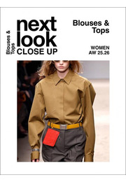
next look Close Up Women Blouses & Tops A/W 25/26
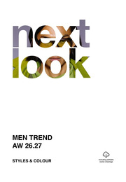
NEXT LOOK Men Trend A/W 26/27 - Styles & Colour
Trend Bible Kids Life Ebook - S/S 2026
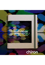
Chiron Caleidoscopio (Colori) 27_1 A/W 26/27
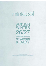
Minicool - Newborn & Baby A/W 26/27
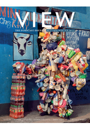
View 150
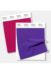
Polyester Swatch Card
next look Style & Accessories A/W 26/27
Next Look S/S 2026 - Styles & Accessories
OvN Insights Digital Subscription
ColoRush S/S 2027
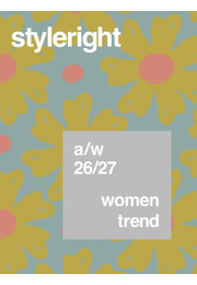
Style Right Women TREND A/W 26/27
Trend Union - PROUD SOUTH CRAFT
Next Look Close Up Men Outerwear A/W 25/26
1
2
3
4
5
…
19
Next