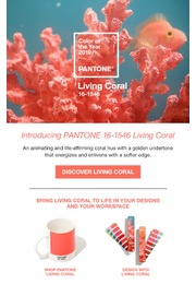
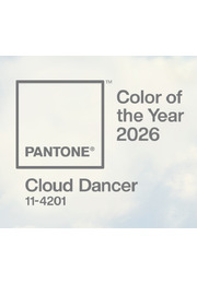
Pantone Color of the Year 2020
PANTONE 19-4052 Classic Blue
Instilling calm, confidence, and connection, this enduring blue hue highlights our desire for a dependable and stable foundation on which to build as we cross the threshold into a new era.
A timeless and enduring blue hue, PANTONE 19-4052 Classic Blue is elegant in its simplicity. Suggestive of the sky at dusk, the reassuring qualities of the thought-provoking PANTONE 19-4052 Classic Blue highlight our desire for a dependable and stable foundation on which to build as we cross the threshold into a new era.
“We are living in a time that requires trust and faith. It is this kind of constancy and confidence that is expressed by PANTONE 19-4052 Classic Blue, a solid and dependable blue hue we can always rely on,” said Leatrice Eiseman, Executive Director of the Pantone Color Institute. “Imbued with a deep resonance, PANTONE 19-4052 Classic Blue provides an anchoring foundation. A boundless blue evocative of the vast and infinite evening sky, PANTONE 19-4052 Classic Blue encourages us to look beyond the obvious to expand our thinking; challenging us to think more deeply, increase our perspective and open the flow of communication.” - Leatrice Eiseman, Executive Director of the PANTONE Color Institute
Imprinted in our psyches as a restful color, PANTONE 19-4052 Classic Blue brings a sense of peace and tranquility to the human spirit, offering refuge. Aiding concentration and bringing laser like clarity, PANTONE 19-4052 Classic Blue re-centers our thoughts. A reflective blue tone, Classic Blue fosters resilience.
As technology continues to race ahead of the human ability to process it all, it is easy to understand why we gravitate to colors that are honest and offer the promise of protection. Non-aggressive and easily relatable, the trusted PANTONE 19-4052 Classic Blue lends itself to relaxed interaction. Associated with the return of another day, this universal favorite is comfortably embraced.
Classic Blue in Fashion
PANTONE 19-4052 Classic Blue is a poised and self-assured blue hue elegant in its simplicity. Genderless in outlook and seasonless in endurance, this foundational anchor shade enables color mixes throughout the spectrum, as well as making a strong statement on its own. Emblematic of heritage but at the same time highly contemporary, versatile PANTONE 19-4052 Classic Blue takes on distinct appearances through application to different materials, finishes and textures from shimmering metallics, lustrous sheens and high-tech materials to hand crafted looks and more fragile fabrics.
In the ultimate display of personal expression, PANTONE 19-4052 Classic Blue makes a dramatic statement for eyes, nails and hair in a variety of finishes from glittery and glam to dusty matte.
Classic Blue in Home Décor
Offering the promise of protection PANTONE 19-4052 Classic Blue is a pervasive favorite for home. Creating a stable foundation from which to build, PANTONE 19-4052 Classic Blue injects creative confidence into interiors, transforming a space through unique color combinations and tonal statements. Easily applied across so many different materials, textures and finishes, PANTONE 19-4052 Classic Blue is a dependable blue that can take you in different directions expressing tradition and elegance as well as unexpected boldness.
Classic Blue in Graphic Design and Packaging
Because of PANTONE 19-4052 Classic Blue’s relation to the sky at dusk, something we see every day, it maintains a perception of dependability and constancy. A color we respond to viscerally as being trustworthy, PANTONE 19-4052 Classic Blue is an ideal shade for many applications of graphic design. This is especially true for packaging where PANTONE 19-4052 Classic Blue conveys the message of honesty, credibility and reliability that today’s consumers are connecting to.
Classic Blue in Food and Beverage
Blue foods and beverages including PANTONE 19-4052 Classic Blue like shades are rich in anthocyanins. With this relationship to wellness and self-care these blue foods help to build a solid foundation, acting as a form of protection for good health. In addition to their natural health benefits, these blue foods also bring style and sophistication to the table.
Classic Blue as a Multi-Sensory Experience
In addition to releasing the iconic Pantone color swatch for PANTONE 19-4052 Classic Blue, Pantone has collaborated with a number of sensory experts from the worlds of music, food, fashion, beauty and technology to envision PANTONE 19-4052 Classic Blue as a sound, a smell, a taste, and a feeling. Taken together, all of these sensory inputs have been designed to inspire creatives and consumers to think about color differently, to uncover new patterns and associations, and to encourage them to create new experiences that speak to people’s hearts as well as their minds.
About Pantone Color of the Year
For over 20 years, Pantone’s Color of the Year has influenced product development and purchasing decisions in multiple industries, including fashion, home furnishings, and industrial design, as well as product packaging and graphic design.
The Pantone Color of the Year selection process requires thoughtful consideration and trend analysis. To arrive at the selection each year, Pantone’s color experts at the Pantone Color Institute comb the world looking for new color influences. This can include the entertainment industry and films in production, traveling art collections and new artists, fashion, all areas of design, popular travel destinations, as well as new lifestyles, playstyles, and socio-economic conditions. Influences may also stem from new technologies, materials, textures, and effects that impact color, relevant social media platforms and even upcoming sporting events that capture worldwide attention.
About The Pantone Color Institute™
The Pantone Color Institute is the business unit within Pantone that highlights the top seasonal runway colors, selects the Pantone Color of the Year, forecasts global color trends, and advises companies on color for product and brand visual identity. Through seasonal trend forecasts, color psychology, and color consulting, the Pantone Color Institute partners with global brands to effectively leverage the power, psychology, and emotion of color in their design strategy.