PANTONE Portable Guide Studio | 8 Professional Graphics Colour Guides
Eight essential Pantone Graphics fan guides with 8,706 market-relevant colours in a compact case for print, branding, packaging and digital design.
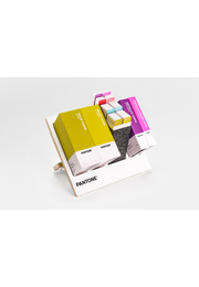
The PANTONE Portable Guide Studio is a comprehensive professional colour communication system that brings eight essential Pantone Graphics fan guides together in one compact carrying case. Designed for graphic designers, creative directors, brand teams, packaging specialists, printers, prepress professionals, digital designers and design schools, it provides immediate access to 8,706 market-relevant colours for inspiration, specification, comparison and production.
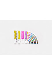
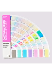
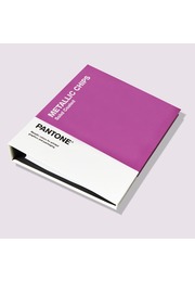
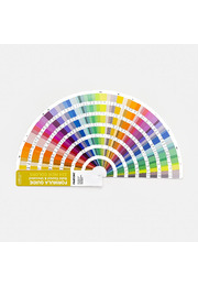
The set contains the PANTONE Formula Guide Coated and Uncoated, Color Bridge Guide Coated and Uncoated, CMYK Guide Coated and Uncoated, Metallics Guide Coated and Pastels & Neons Guide Coated & Uncoated. Together, these eight portable fan decks cover traditional spot colours, spot-to-process comparisons, four-colour process references and specialty metallic, pastel and neon shades.
This breadth makes the Portable Guide Studio particularly valuable for modern projects that move between different media and production methods. A brand colour may begin as a Pantone spot colour, require a CMYK alternative for commercial printing and later need corresponding digital values for websites, animation or other screen-based communication. By keeping the principal Pantone Graphics colour tools together, the set supports these transitions within one organised workflow.
The Formula Guides provide all 2,614 traditional Pantone spot colours, including 224 vibrant new graphics colours created to extend contemporary creative choice. Spot colours are printed with individually mixed inks and are especially important when a defined logo, corporate colour, packaging shade or campaign colour must remain recognisable and repeatable. Each colour is displayed with its Pantone number and ink formulation, giving designers, clients and printers a shared technical colour language.
The Formula Guide includes coated and uncoated references because paper surface substantially affects colour appearance. Coated paper usually holds ink closer to the surface, producing a cleaner, sharper and often more saturated result. Uncoated stock absorbs more ink and can make the same colour appear softer, more matte or less intense. Comparing the C and U versions helps professionals select the correct reference before artwork, proofing and production begin.
The Color Bridge Guides present 2,587 spot-to-process colour comparisons. Pantone spot colours are shown alongside their closest CMYK simulations, helping teams understand what can happen when a specially mixed ink is converted into standard four-colour printing. This is essential because some Pantone spot colours cannot be reproduced exactly in CMYK. The guides help designers identify visible differences early, set realistic expectations and communicate suitable alternatives.
Color Bridge also connects physical colour specification with digital design by providing relevant process and screen values. This makes it especially useful for brand systems that need to remain coherent across packaging, printed marketing, websites, presentations, digital advertising, video and animation. Rather than assuming that one colour value will appear identical in every medium, teams can establish coordinated references for each output environment.
The two CMYK Guides add 2,868 four-colour process colours on coated and uncoated stock. These colours are created directly through combinations of cyan, magenta, yellow and black and are useful when a project is planned for process printing rather than Pantone spot ink. Designers can select CMYK colours from physical printed references, supporting more realistic decisions for brochures, publications, labels, packaging and promotional materials.
The Metallics Guide and Pastels & Neons Guide expand the collection with 865 specialty spot colours. Metallic shades provide reflection, visual depth and premium impact for packaging, labels, logos and high-value printed communication. Pastels introduce softer and more refined tonal possibilities, while neons create intense, attention-focused colour for promotional, graphic and packaging concepts that require greater visibility.
Every colour is presented with its corresponding Pantone number and the relevant ink formulation or process values. Colours are arranged chromatically, allowing users to browse related families, compare neighbouring tones and develop palettes intuitively. The new colour pages are positioned at the front of the relevant guides for immediate access, while numerical indexes at the back make specific Pantone references easy to locate.
The guides are printed on widely used professional paper weights: 100 lb coated stock, equivalent to 168 g/m², and 80 lb uncoated stock at 118 g/m². These physical references help users evaluate colours on surfaces that are relevant to real print workflows. Screen representations alone cannot reliably show the influence of paper, ink absorption, monitor calibration, output profile or ambient light on final colour appearance.
Lighting Indicator pages demonstrate whether the surrounding conditions are suitable for visual colour evaluation. Unsuitable illumination can make a printed shade appear warmer, cooler, lighter or darker and may lead to avoidable approval errors. Checking the viewing environment supports more dependable colour decisions during studio reviews, client presentations, supplier discussions, proof approvals and press checks.
The sleek carrying case keeps all eight guides organised, protected and ready to transport. It allows creative and production teams to move the complete colour toolkit between the studio, client meetings, classrooms, supplier briefings and print-production environments without handling several loose guides. This portability is particularly valuable for professionals whose colour decisions take place at multiple locations.
For branding teams, the Portable Guide Studio supports the development and maintenance of colour standards across physical and digital touchpoints. Packaging designers can compare conventional spot colours, CMYK alternatives, metallic effects, pastels and neons before selecting the right production strategy. Printers and prepress teams gain access to ink formulations and process-colour references, while digital creatives can connect physical colour decisions with screen-based applications.
The PANTONE Portable Guide Studio is not a substitute for a final production proof on the intended material. Paper type, printing method, ink film, coating, finishing and viewing conditions can all influence the finished result. Used alongside appropriate proofs and controlled lighting, however, the set provides a reliable foundation for colour inspiration, colour matching, specification, communication and verification.
For creative teams that need the essential Pantone Graphics tools in one mobile system, the PANTONE Portable Guide Studio offers exceptional range and workflow value. It brings spot, process and specialty colours together in eight practical fan decks, helping professionals explore more possibilities, communicate colour more precisely and move from creative concept to final production with greater confidence.
Key Benefits
- Eight essential Pantone Graphics fan guides
- Sleek, compact and protective carrying case
- Access to 8,706 market-relevant colours
- Includes Formula Guide Coated and Uncoated
- Includes Color Bridge Guide Coated and Uncoated
- Includes CMYK Guide Coated and Uncoated
- Includes Metallics Guide and Pastels & Neons Guide
- 2,614 traditional Pantone spot colours
- 224 vibrant new graphics colours
- 2,587 spot-to-process colour comparisons
- 2,868 four-colour process colours
- 865 metallic, pastel and neon specialty colours
- Pantone numbers, ink formulations and process values
- Chromatic organisation and numerical indexes
- Lighting Indicator pages for colour-evaluation checks
- Printed on 168 g/m² coated and 118 g/m² uncoated paper
- Ideal for branding, packaging, print and digital design