PANTONE Color Bridge Supplement Coated & Uncoated | 224 New Colours
Portable Color Bridge supplement with 224 new Pantone spot colours, CMYK comparisons and digital values on coated and uncoated paper.
The PANTONE Color Bridge Supplement Coated & Uncoated expands compatible earlier Color Bridge Guide Sets with 224 new, market-driven Pantone colours. It gives designers, printers, brand teams and production specialists access to the latest colour additions without requiring them to replace their complete existing Color Bridge system.
The portable fan deck presents each new Pantone Spot Colour beside its closest CMYK process-colour equivalent. Corresponding CMYK percentages, RGB values and HTML/Hex references support colour specification for print and digital media. Coated and uncoated versions of all 224 additions are included in one compact professional colour communication tool.
This supplement is intended specifically for users whose compatible Color Bridge guides do not yet contain the 224-colour expansion. It is not a complete Color Bridge Guide and does not repeat the entire Pantone Graphics collection. Its focused format provides an economical and resource-efficient way to bring an earlier colour library up to date while retaining the original guides already used within the studio or production department.
Pantone developed the new colours to fill relevant gaps within the Pantone Matching System. The additions introduce greater nuance and palette depth, including an expanded selection of dark neutrals. These sophisticated, robust shades provide more precise alternatives for brand identities, premium packaging, editorial design and contemporary visual communication.
The collection also responds to evolving creative and commercial colour directions. Its 224 vibrant additions broaden the available spectrum with colours designed to feel current and expressive while remaining practical for professional specification. Creative teams gain more options for differentiating product ranges, refining established brand palettes or building new colour systems with greater tonal control.
A Pantone Spot Colour and its CMYK simulation are not technically identical. Spot colours are produced using specifically mixed inks, while CMYK printing builds colour from combinations of cyan, magenta, yellow and black. Because these reproduction methods have different colour gamuts, an exact process-colour match is not always possible.
The Color Bridge format makes the conversion result visible before production begins. Each original spot colour is printed directly beside its nearest CMYK process build, allowing designers, clients and printers to assess how closely standard four-colour printing can reproduce the intended shade. This physical comparison is more informative than relying solely on an on-screen simulation or automatic software conversion.
When the difference is acceptable, the CMYK values provide a practical starting point for artwork and process printing. If the conversion loses too much saturation, depth or colour character, teams can retain the original Pantone Spot Colour, adjust the process build or select an alternative colour that reproduces more effectively.
Every new colour also includes RGB and HTML/Hex values. These references help translate Pantone colour intentions into websites, interfaces, digital campaigns, video and animation. Color Bridge is the only Pantone guide format that combines Pantone Spot Colours with CMYK, RGB and HTML values, making this supplement especially useful for cross-media brand systems.
Digital values do not guarantee identical colour on every display. Monitor calibration, colour profiles, browser rendering, display technology and ambient lighting all influence screen appearance. They provide coordinated starting points that allow digital teams to work from the same Pantone colour language used by graphic designers, packaging specialists and print suppliers.
All 224 colours are presented on coated and uncoated paper. The coated section appears at the front of the guide, followed by the corresponding uncoated references. This structure makes it possible to evaluate how the same colour direction behaves on two common categories of commercial print substrate.
The coated colours are printed on 100 lb paper with a weight of 148 g/m². Coated stock keeps more ink near the surface and generally produces a cleaner, sharper and more saturated result. The uncoated colours use 80 lb paper at 118 g/m². Its more absorbent surface often creates a softer, more matte and less concentrated appearance.
These material differences are important for brand and packaging consistency. A colour selected for coated cartons, labels or promotional print may appear noticeably different on stationery, inserts, booklets or natural-finish packaging. Having both references in the same supplement supports more informed substrate-specific colour specification.
Pantone’s updated, more environmentally considerate ink formulation is designed to support coating during print production, helping protect printed graphics and packaging applications. Printers should still confirm ink, coating, substrate and finishing compatibility for the specific production process before final approval.
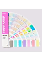
The colours are arranged chromatically, allowing users to scan related colour families and develop palettes intuitively. The compact handheld fan format is easy to carry between design studio, client presentation, supplier meeting and press check. It can be used wherever colour needs to be explored, compared, explained or specified.
For graphic designers, the supplement introduces additional colour options for logos, publications, campaigns and corporate communication. Brand teams can expand or refine existing identity palettes. Packaging specialists can evaluate spot and process-colour strategies on coated and uncoated materials, while printers and prepress teams gain physical references for discussing conversion expectations.
The guide also supports digital design, animation and video production when Pantone colour decisions must be translated into screen values or related to CMYK-printed materials. It keeps creative and technical teams connected to one defined colour reference throughout cross-platform production.
The supplement is useful throughout the workflow: initial inspiration, palette development, client presentation, colour specification, artwork creation, proof review and press evaluation. A shared physical reference reduces subjective descriptions and helps international teams communicate new Pantone colours with greater clarity.
Pantone Connect can complement the printed supplement with access to more than 20,000 current Pantone colours, Adobe application integration, palette tools, digital conversion and collaborative functionality. Pantone Connect is separate from the physical fan deck and may require a trial or paid subscription.
The printed spot and CMYK samples are professional references rather than guarantees of a specific production result. Paper, ink, press calibration, colour profiles, coating and finishing can all affect final colour. Binding approval should therefore use a production proof or press sheet on the intended substrate under suitable lighting.
For professionals who own a compatible earlier Color Bridge edition, the PANTONE Color Bridge Supplement Coated & Uncoated is a targeted and cost-effective update. It adds 224 contemporary colours, physical spot-to-process comparisons and coordinated digital values without requiring the full colour system to be replaced.
Key Benefits
- Adds 224 new Pantone colours to compatible Color Bridge sets
- Focused update without replacing the complete guide system
- Pantone Spot Colours shown beside closest CMYK equivalents
- CMYK percentages for four-colour process printing
- RGB values for digital applications
- HTML/Hex values for web design
- Coated and uncoated references in one fan deck
- Coated colours positioned before uncoated colours
- Printed on 100 lb / 148 g/m² coated paper
- Printed on 80 lb / 118 g/m² uncoated paper
- Expanded selection of nuanced dark neutrals
- Chromatic arrangement for palette development
- Compact and portable handheld format
- Updated ink formulation designed to support print coating
- Supports workflows from colour inspiration to press check