Toggle navigation
€ 0,00
Mode information
Account
€ 0,00
Search your product
Zoek
Sluit zoekveld
English
Nederlands
Français
Close sidebar
Webshop
Colour systems
Seminars
Brands
Online trends
Contact
Jobs
About us
News
Contact
nl
en
fr
Account
choose your category ...
Magazines
Forecasts
Books
Swatches, replacement pages, TPG sheets, chips...
Online products
Seminars
Colour systems
Pantone Swatch Cards
choose your category ...
Pantone
RAL Colours
Munsell
Colour Management
Pantone Swatch Cards
Home
Webshop
Welcome to our webshop!
Refine results
Search your product
Style Right Baby Trend S/S 2028
Style Right Sports Spring/Summer 2028
next look Women Fashion Trends Fall/Winter 27/28
next look Women Fashion Trends S/S 2027
Prints & More Nouvezaar / Royal Paradox
Prints & More Book - Animorph/Projections/Nouvezaar/Royal Paradox
W.A.S.C We are sports Colors Spring / Summer 2028
W.A.S.D Athleisure - Sport Fashion A/W 27/28
W.A.S.D Outdoor - Mountaineering A/W 27/28
W.A.S.D Fitness - Running - Training - Yoga A/W 27/28
W.A.S.C We are the sports Colors - A/W 27/28
next look Men Fashion Trend A/W 27.28
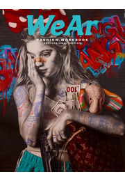
WEAR 86
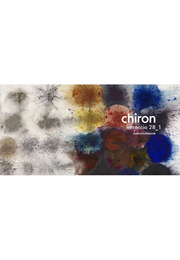
Chiron Intreccio (Trends) A/W 27/28 - (28-1)
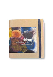
Chiron Caleidoscopio (Colori) 28-1 - A/W 27/28
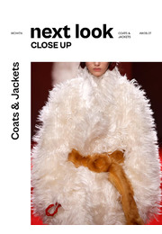
next look Close Up Women Coats & Jackets A/W 26/27
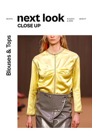
next look Close Up Women Blouses & Tops A/W 27/28
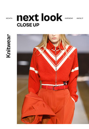
next look Close Up Women Knit A/W 26/27
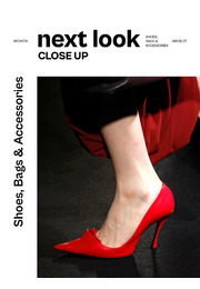
next look Close Up Women Shoes, Bags & Accessories A/W 26/27
Trend Union General Trends AW 27/28
Trendhouse Casual & Sportswear Spring / Summer 2028
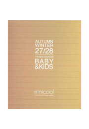
Minicool Baby & Kids A/W 27/28 - Printed version
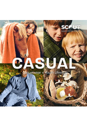
SCOUT Casualwear + Youth Lifestyle A/W 27/28
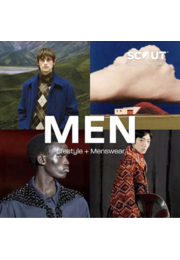
Scout Men Lifestyle & Menswear A/W 27/28 - Gedrukt boek
1
2
3
4
5
…
18
Next