Toggle navigation
€ 0,00
Mode information
Account
€ 0,00
Search your product
Zoek
Sluit zoekveld
English
Nederlands
Français
Close sidebar
Webshop
Colour systems
Seminars
Brands
Online trends
Contact
Jobs
About us
News
Contact
NL
EN
FR
Account
choose your category ...
Magazines
Forecasts
Books
Swatches, replacement pages, TPG sheets, chips...
Online products
Seminars
Colour systems
Order your
Pantone Swatch Cards
choose your category ...
Pantone
RAL Colours
Munsell
Colour Management
Order your
Pantone Swatch Cards
Home
Webshop
Welcome to our webshop!
Refine results
Search your product
Style Right Kidswear TREND S/S 2027
STYLE RIGHT Kids graphics S/S 2027
Style Right Men Graphics S/S 2027
Prints & More Book Primal Echo & Majestic
Viewpoint Colour no. 17
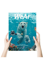
WEAR 83
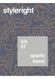
Style Right Sports Trend S/S 2027
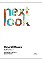
Next Look Colour Usage A/W 26/27
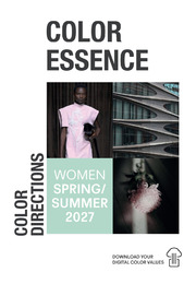
Color Essence Women S/S 2027
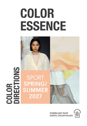
Color Essence Sports S/S 2027
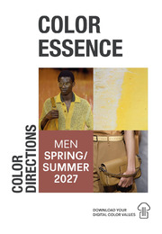
Color Essence Men S/S 2027
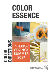
Color Essence Interior S/S 2027
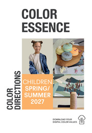
Color Essence Children S/S 2027
Textile Report A/W 26/27 Part #2
Style Right Baby & Toddler Trend S/S 2027
Style Right Babywear S/S 2027
TREND UNION LIFESTYLE - Design & Interiors 2027
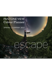
Pantone® View Colour Planner # 56 - S/S 2027
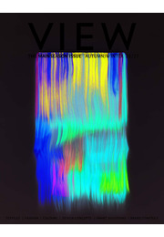
View 151
Scout LIFE + HOME Autumn/Winter 2026/7
Scout Women A/W 26/27 Hardcopy
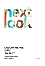
Next Look Colour Usage Men A/W 26/27
Next Look Colour Usage Women A/W 26/27
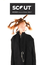
SCOUT MEN - Autumn/Winter 2026/2027
1
2
3
4
5
…
18
Next