PANTONE Color Bridge Guide Uncoated | 2,587 Spot-to-CMYK Colour Matches
Portable Pantone guide comparing 2,587 spot colours with their closest CMYK matches on uncoated paper, plus RGB and HTML values.
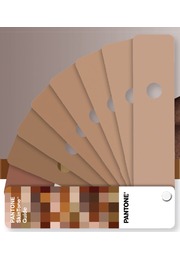
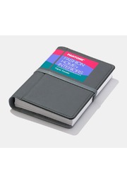
The PANTONE Color Bridge Guide Uncoated is a professional colour conversion and communication tool for translating Pantone Spot Colours into their closest CMYK process-colour equivalents. The compact fan deck presents side-by-side comparisons for all 2,587 Pantone Spot Colours and supplements them with CMYK, RGB and HTML values for print and digital applications.
Designed for graphic designers, brand teams, packaging specialists, printers, prepress professionals, marketing departments and digital creatives, the guide creates a shared reference for projects that must move between Pantone spot-colour printing, standard four-colour production and screen-based media. Its uncoated paper references are especially relevant for stationery, brochures, booklets, inserts, labels, packaging and other applications produced on absorbent, matte substrates.
Pantone Spot Colours and CMYK process colours use fundamentally different reproduction methods. A Pantone Spot Colour is printed with a specifically mixed ink, while CMYK builds colour through combinations of cyan, magenta, yellow and black. Because the two systems have different colour gamuts, some Pantone colours convert convincingly into CMYK, while others become less saturated, lighter, darker or visibly different in hue.
Color Bridge makes these differences visible before artwork reaches production. Each original Pantone Spot Colour appears beside its nearest industry-standard CMYK match. Designers, clients and printers can therefore judge the available process-colour result using a physical printed reference instead of depending entirely on a monitor or automated software conversion.
This comparison is commercially important. If a CMYK match is sufficiently close, a project may be produced through standard four-colour printing without adding a separate spot ink. If the difference compromises brand recognition, visual impact or product differentiation, teams can retain the Pantone Spot Colour, choose a more reproducible alternative or define an intentionally adjusted CMYK standard.
The updated guide contains 2,587 Pantone Spot Colours, including 224 new, trend-driven PMS colours. These bold additions extend the system with fresh options for contemporary branding, packaging, editorial design and visual communication. They are placed at the beginning of the guide for quick discovery, while the complete collection is arranged chromatically to support intuitive exploration of colour families and related shades.
The Uncoated edition is printed on widely used 80 lb uncoated paper with a weight of 118 g/m². Unlike coated stock, uncoated paper has a more porous surface that absorbs a greater proportion of the ink. Colours frequently appear softer, more matte and less saturated, while fine tonal differences and darker shades can behave differently than they do on coated paper.
Evaluating colour on the appropriate substrate is therefore essential. A reference printed on coated paper cannot reliably predict how the same colour will appear on letterhead, stationery, an uncoated brochure, a book page or a natural-finish packaging component. The Color Bridge Guide Uncoated provides a substrate-specific reference that helps teams assess these effects before proofing and production.
Pantone states that the guide is aligned with G7-calibrated CRPC6 and CRPC3 press references for uncoated paper stocks. These established print reference conditions provide a controlled basis for visualising industry-standard CMYK conversion. They help designers, print buyers and production partners communicate process-colour expectations more consistently and evaluate proofs against a relevant benchmark.
Every Pantone reference is accompanied by CMYK percentages, RGB values and HTML/Hex information. Color Bridge is the only physical Pantone guide that combines these three conversion formats with Pantone Spot Colours. It is therefore particularly useful for integrated identities and campaigns that must coordinate colour across printed graphics, packaging, websites, social media, video, animation, interfaces and digital advertising.
The CMYK percentages give artwork and prepress teams a defined starting point for process printing. RGB and HTML values help digital teams translate the same Pantone colour intention into screen-based applications. This shared data supports more coherent cross-media colour communication while acknowledging that printed inks and illuminated displays cannot produce colour in exactly the same way.
Brand teams can use the guide to establish related spot, process and digital references within colour guidelines. Packaging designers can assess whether a Pantone colour remains effective when converted for uncoated cartons, labels or inserts. Graphic designers can define realistic CMYK values for corporate stationery and editorial materials, while web, video and animation teams gain directly connected RGB and HTML values.
The chromatic organisation supports open-ended colour inspiration and palette development. When a specific colour number is already established, the numeric index at the back of the guide provides its location quickly. This combination makes the fan deck efficient during creative exploration, technical colour specification, artwork preparation, supplier communication and production review.
A Lighting Indicator page demonstrates whether the surrounding illumination is suitable for visual colour evaluation. Inappropriate light can make colours appear warmer, cooler, lighter or darker and may distort the perceived difference between a Pantone Spot Colour and its CMYK match. Checking the viewing environment improves the reliability of studio reviews, client presentations, proof approvals and press checks.
The portable handheld format allows the guide to travel easily between the design studio, customer meeting, brand department, print supplier and production site. Everyone involved can work with the same physical reference throughout the project, reducing ambiguity and making colour decisions easier to explain, share and document.
Pantone Connect can complement the physical fan deck with access to more than 20,000 current Pantone colours, Adobe application integration, colour conversion, palette creation and collaborative digital workflows. Pantone Connect is separate from the physical guide and may require a trial or paid subscription.
The printed Color Bridge references are professional conversion benchmarks rather than production guarantees. Actual CMYK output is influenced by paper, ink, press calibration, screening, colour profiles, production tolerances and finishing. Final approval should therefore use a production proof or press sheet on the intended substrate under controlled lighting.
For projects that combine uncoated print, Pantone Spot Colours, CMYK production and digital media, the PANTONE Color Bridge Guide Uncoated provides essential colour intelligence. It makes conversion differences visible, helps prevent unrealistic expectations and gives creative and technical teams a common colour language throughout the complete design and production workflow.
Key Benefits
- 2,587 Pantone Spot Colours with CMYK comparisons
- Includes 224 new, trend-driven PMS colours
- Spot and process colours shown side by side
- CMYK percentages provided for every colour
- RGB values for screen-based applications
- HTML/Hex values for web and digital design
- Printed on 80 lb / 118 g/m² uncoated paper
- Aligned with G7-calibrated CRPC6 and CRPC3 references
- Chromatic arrangement for intuitive colour selection
- New colours positioned at the beginning of the guide
- Numeric index for locating colours quickly
- Lighting Indicator page for viewing-condition checks
- Portable handheld fan-deck format
- Supports workflows from inspiration to press check
- Ideal for branding, packaging, print and digital design